
Table of Contents
Toggle
![]() English
English ![]() فارسی (Persian)
فارسی (Persian) ![]() Türkçe (Turkish)
Türkçe (Turkish)

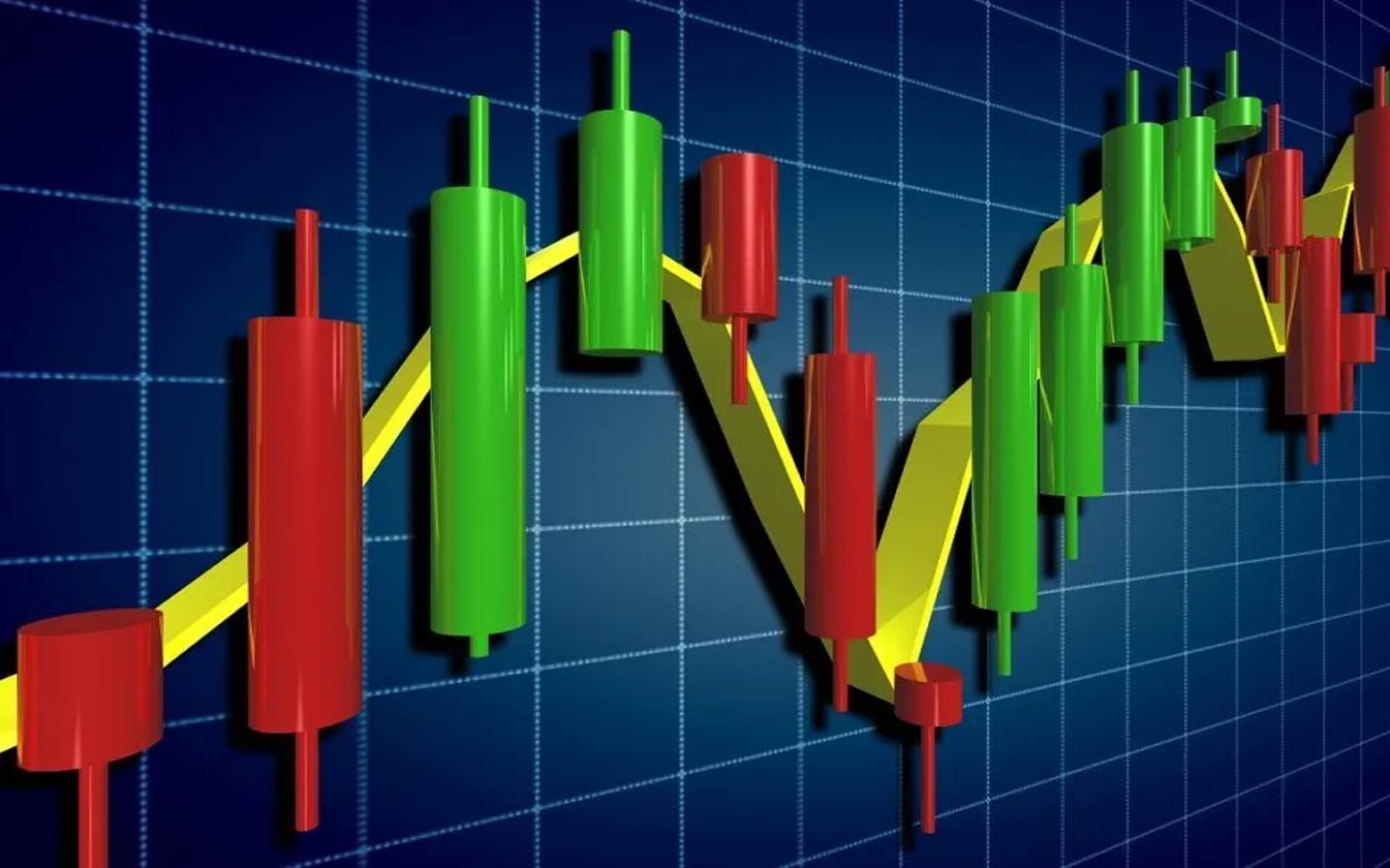
In the process of examining price changes using charts, each of the bars formed in the candlestick chart is called a candlestick. In the candlestick chart, each of the bars or candles represents the changes in the price of the asset in question in a certain period of time. The methods of examining these charts to predict the market trend, which is called technical analysis, requires full training in candlesticks and the knowledge of digital currency candlestick chart analysis.
Traders need to know candlestick patterns in digital currency candlestick training. Candleology is actually the science of studying the behavior of candles. Each candle has four characteristics: starting price, closing price, candle body and shadow.
Considering the importance of digital currency candlestick chart analysis and knowing the best candlesticks for trading to predict the future of digital currency types, in the rest of this article, what are concepts such as candlesticks? And I will pay zero to hundred candlesticks and photos of candlestick patterns.
What is a candlestick chart?
A candlestick chart is one of the important financial charts that shows the movement of the price of a currency in a certain period of time. This chart has a number of candles, each of which represents the same unit of time. The time unit of this chart is different based on the choice of the chart makers and can range from one second to one year.
Traders in financial markets examine the probability of price movement in different directions with the help of candlestick charts and make their decisions based on the results of these analyses. In fact, digital currency candlestick analysis shows detailed information about the current and past movements of cryptocurrencies;
And that’s why traders and market analysts prefer this chart to other charts.

What is a candle?
In drawing a candlestick chart, you need a set of price values in each specific time frame that you decide to display. By looking at the photo of the candlestick patterns, the hollow or filled parts of the candlestick are called Body. The thin lines at the top and bottom of the candlestick body represent the range of the lowest and highest prices and are known as shadows.
Opening price or Open
Depending on the higher or lower movement of an asset’s price during each time frame, the top or bottom of the candlestick body indicates the open price. If the price trend is upward and the candle is closed above the Open price, the Open price of the candle will be shown at the bottom of the body and the candle will be closed at the top.
Now, if the price trend is downward and the candle closes below the Open, the Open will appear as the top of the candle and the close will appear at the bottom.
Maximum price
High The price of each asset in a certain time frame is shown by the tail or the upper shadow of the candle body. If the opening and closing price of the candlestick is equal to the maximum price, there is no upper shadow.
minimum price
Low price in each time frame is displayed as a tail under the body or low shadow. If the opening or closing point of the candle is equal to the minimum price, there is no shadow.
Close price
When the candle period ends, the last price is the close price. In this case, the candle is completed and a new candle is formed. The closing price is the last traded price during the candle, which is marked on the top of the body of a green candle or on the bottom of the body of a red candle.
If the value of an asset rises above its initial price in a certain period of time, the candle closes above the Open price and a hollow or green candle is formed. In this candle, the bottom of the body represents the open price and the top of the body represents the close price.
If the price of the asset closes lower than the initial price, a red or black candle is formed, which is above the body of the Open price and below the body of the close price.
A candle being formed on a candlestick will continuously change during price movements. The open price will remain fixed until the candle is completed, and the high and low prices will change. The color of the candle may also change from green to red during its formation. For example, if the current price is above the Open price, but then falls below it, the color of the candlestick will change from green to red.
price direction
Checking the direction of price movement during the time period can be recognized through the color and position of the candles.
price range
The distance between the maximum and minimum price of the candlestick is the range that the price moves during the time period. The range of each candle is calculated based on subtracting the low price from the high price.

Constituents of candlesticks in candlestick chart
Candlesticks or candlesticks in a candlestick chart have two parts: body and shadow, which I will explain in the analysis of digital currency candlestick chart or candlestick analysis:

Candle body in candle stick
The candle body in the candlestick shows the opening and closing price of the desired cryptocurrency in a certain time period. Also, the location of the start and end price will depend on whether the price of that currency is falling or rising.
If the market is bullish, the final price will be higher than the initial price, and if the market is bearish, the final price will be lower than the initial price. The gap between the opening and closing price has formed the body of the candle. The body of each candle has two colors, red and green. The body of the candle actually represents the opening and closing price of the digital currency.

Candle Wick
Each candle has two shadows, either Candle Wick or Shadow. Of course, some candles may have only one shade or even no shade. The candlestick shadow shows the minimum and maximum price that the asset in question has achieved in that time frame.
Therefore, the upper shadow of the candle represents the highest price and the lower shadow represents the lowest price. When the upper or lower shadow is the same as the opening or closing price, the desired candle may be without a shadow or with a shadow.

History of the candlestick chart
The use of charts and their analysis began in the 17th century by the Japanese in the rice trade. In 1850, the first candlestick or candlestick chart was created by a Japanese rice trader named Homa from Sakata city. Chances are, this person’s original ideas were refined over the years of the business, eventually culminating in the candlestick that is used today.
But the chart known today as candlestick was created by Charles Dow in 1900. Naturally, the original Japanese version differs from the American version, however, they follow the same principles. principles such as:
- What is important is why. In the end, the price is important, not the reasons for its change and the news.
- All known information is specified in the price.
- The price may not reflect the underlying value at the moment.
- Markets are volatile.
- Buyers and sellers move markets based on greed and overall emotions and expectations.
Today, it is popular to use candlestick chart and digital currency candlestick chart analysis for traders to access market opportunities and profit making.

Digital currency candlestick chart analysis
The candlestick chart comes with a design that makes it easy to interpret and read due to the abundance of information it provides. Candlesticks are more useful than traditional bar charts. Many traders use candlesticks, classic patterns of technical analysis and other technical analysis methods to invest in digital currency and reduce their financial risk .
Advanced candlestick and cryptocurrency candlestick chart analysis provides an attractive visual representation of price action due to its simple interpretation. The relationship between open and close price will provide vital data for traders. The trader will thus be able to check the price trend line.
In the candlestick chart, the oscillator is a tool that can be used to analyze the digital currency candlestick chart more precisely. These tools use the data and values of the candles to calculate them.
Reversal signals and divergences obtained in the indicator can be confirmed by candlestick patterns. What is certain is the importance of these patterns in the candlestick chart for trading. Of course, there are also separate indicators to recognize candlestick patterns used on the candlestick chart.

A candlestick chart actually depicts the battle between buyers in a bull market and sellers in a bear market over a specific time frame. When the closing price of the candle is close to the maximum price (high), a bull market is formed, and vice versa, when the closing price is close to the minimum price (low), a bear market is formed.
In the candlestick, green candles represent buying pressure and red candles represent selling pressure. A longer candle body can also show the intensity of buying or selling pressure. On the contrary, the short body of the candles indicates a small movement of the price and finally it can depict the stabilization.

Division of market transactions based on candlestick chart
In general, based on the candlestick chart, market transactions can be divided into 6 categories:
- In the candlestick chart, long white candles represent that buyers are in control of the market most of the time.
- In the candlestick chart, long black candles indicate that sellers are in control of the market most of the time.
- Candlesticks with small bodies indicate that neither buyers nor sellers can move the market and prices will close at the starting point.
- A long shadow under the candle indicates that the bears have controlled the market for a period of time; In fact, the sellers have dominated the transactions and reduced the prices during the transactions. But after a while, the control is out of their hands and the buyers have a significant return. Finally, it represents the buying pressure and the market's rising power.
- The presence of a long shadow above the candle indicates that the market is controlled by the bulls in a period of time; But in the end, sellers took over the market. In the end, it shows the weakness of the buyers and the unsuccessful attempt of the market to climb.
- A candlestick with a long shadow on both the upper and lower sides indicates that none of the bears and bulls have been able to overcome the other over time and a stalemate or uncertainty has been created in the market.
But the candles in the candlestick or candlestick chart only show the relationship between the open price and the close of the candle and do not reflect the price changes between the open and close of the candle. high and low of each candle is undeniable and clear; But candles cannot tell which came first.
For example, by observing a long and ascending candle, it is assumed that the prices have increased most of the time. However, the price in that period can have more fluctuations. In fact, in lower time frames, there can be hundreds of potential combinations that could lead to the formation of a candle that is derived from various trading activities.
About the Author
This article was written by Farhad Moghadamsalimi, CEO & Founder of EgeMoney, blockchain strategist, and weekly crypto market analyst with 30+ years in finance and capital markets.


